Building Reusable Email Templates
Cam Robert
Published on 04/10/2020
Emails need to look good and email developers need to make sure they look good on all devices and browsers, however creating a custom email layout for every campaign send can be an incredibly resource consuming task. Copying emails or reusing elements from previous sends can save some time, however it’s still a laborious task.

Designing email templates to be modular and reusable is an effective way to increase speed to market without compromising on email design choices.
Disassembling an Email - Template, Layouts and Content Modules

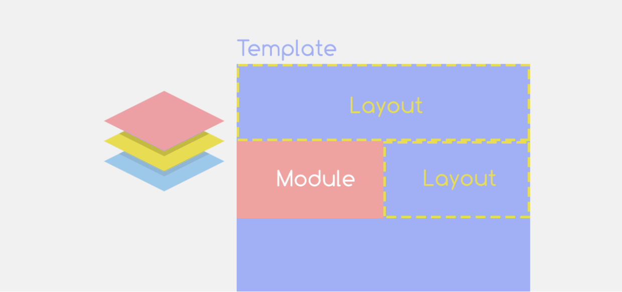
When building a reusable email template, it helps to visualize the design areas as layers that stack on top of each other - like a cake!
Our email cake will have 3 layers:
- Template: The foundation layer that holds the key HTML & CSS structure to support the other 2 layers.
- Layouts: The middle layer of the email that uses style classes built in the Template to change how the email looks on different devices.
- Modules: The top layer and final touches of content, containing pre-formatted HTML, text and images; examples such as a Header, Call-Out, Product Banner, etc.
Just like a real cake, your Template “base” will rarely change, however you may have a few different sizes or styles to suit different use cases. The Layout “middle layer” is where the email/cake begins to take shape. The Module layer is the icing on top, here you have full creative control and can make the final product look exactly as needed.
Now that we’ve covered the basics, let's look more closely at each of these layers.
Template - The Email Base Plate

The template is the bottom layer of your email and contains all the key HTML tags to support your email. This includes the <head>,<style> and <body> tags.
The Stylesheet in your template needs to accommodate anything your email end-users could want to build, so a comprehensive list of style classes is recommended to ensure no further customization is needed. Make sure these styles are designed inline with your practical use cases, as redundant style classes (stylesheet bloat) can have an impact on your viewable email length in some email clients.
Layout Framework - Stack, Squish and Hide
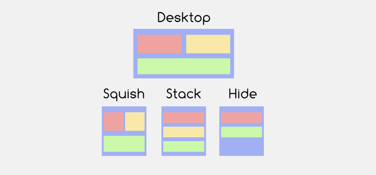
Looking critically at the most common email designs, there are only a handful of unique layout configurations that affect how a responsive email displays. Here are the 3 layout methods that I use to fulfill my design needs:
- Squish: Elements remain side-by-side and get narrower on mobile.
- Stack: Elements can move from side-by-side on desktop to “stacked” on mobile.
- Hide: Elements can toggle hide/show between desktop and mobile.
Here is a sample StyleSheet that can achieve these functions:
<style name="responsive" type="text/css">
.responsive-show {
    display: none !important;
}

@media screen and (max-width: 500px) {
    .responsive-50 {
        width: 50% !important;
        height: auto !important;
    }
    .responsive-100 {
        width: 100% !important;
        height: auto !important;
    }
    .responsive-100-block {
        width: 100% !important;
        height: auto !important;
        display: block !important;
        float: left !important;
    }
    .responsive-hide {
        display: none !important;
    }
    .responsive-show {
            display: block !important;
    }
}
</style>
Code Explanation
The most important element in this stylesheet is the @media declaration. This element is stating that the styles contained within will only activate when the user’s screen is under 500px wide.
Within the @media statement there are a series of styles that produce different responsive layouts. To achieve the “squish” layout, we can use the styles contained in“.responsive-50” and “.responsive-100”. These styles force their element to become 50% or 100% width of the available space, allowing elements to share the same row.
The “stack” layout is achieved with the “.responsive-100-block” style, as it contains instructions to push any following elements below it, denying elements from sharing the same row.
The “hide” layout can be achieved using “.responsive-hide”. This style uses the display attribute to hide elements in mobile view. The reverse can be achieved with “.responsive-show”, which in the stylesheet above will only make an element visible when viewed on a screen width less than 500px.
Take a look at the attached HTML file for an example of how these layouts change between desktop and mobile screen resolutions.
These 3 responsive behaviors can be applied to single and multi-column layouts to create numerous configurations. You can have a 4 column layout on desktop that squish and stack into a 2x2 configuration on mobile, or a 3 column layout on desktop that stacks and hides the middle column when viewed on mobile.
Understanding the kinetic possibilities of a responsive email template is an important step in creating a framework that allows for high reusability. Learning how these styles work can open up new opportunities for unique email features and designs; such as interactive menus, image carousels and embedded email forms!
Responsive Content Modules - Designing for Layouts
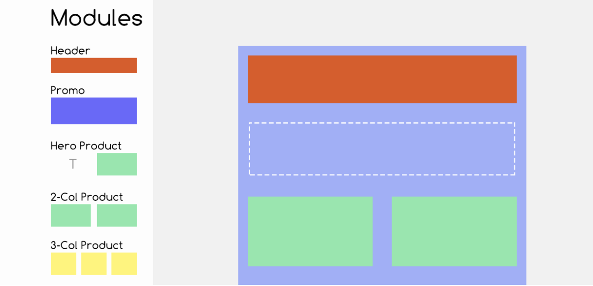
With the structure of the email covered, we can now look at the content blocks or modules. Looking at most marketing emails, it’s common practice for businesses to use the same product or promotion layouts week after week; after all there’s a limited number of ways to display a product in a clear and concise manner. Sometimes this “product module” will be in a single column format 600px wide; other times it might be in a 3-column format at 200px wide each. In both examples above the content is the same, it’s just scaled differently based on the layout it sits within.
When designing content modules, it’s important to think about how they could reasonably be used by the email team, and ensure the CSS and table-containers allow for every use case. Creating a small library of pre-formatted content blocks that are suitable in 1|2|3-column layouts give your email team the flexibility to dynamically create unique emails on the fly.
For example, a brief may require 5 key products be shown in the middle of the email. The end user can drag in the 1x2-coland 1x3-collayouts, one after the other, and use the “Image-Header-Price” module for all 5 products. The standardized approach also means the artworks team doesn’t need to resize product images uniquely for every email - they can keep to a standard set of tile sizes.
This design process also extends to headers and footers too - creating a standardized yet customizable asset pool to choose from. Other supporting elements such as Call-to-Action (CTA) buttons, graphical page dividers or full-width promo banners can also be designed to add more variety to the module library.
How to build your own reusable library
Below is a copy of a reusable email template with some sample layouts to show how the CSS classes work. You can use this as a starting framework to develop your own suite of responsive modules.